all stretched out
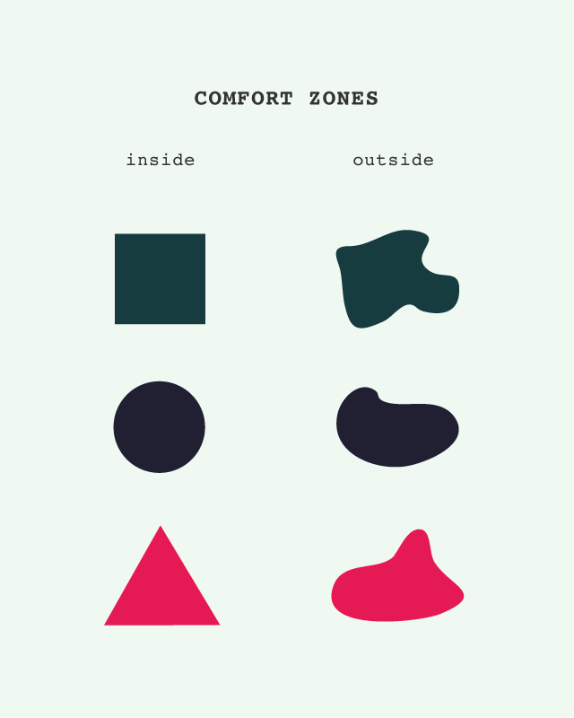 Happy Friday, guys! I was flipping through my sketchbook and I came across several 'inside outside' doodles that I made around the time of this post. In that post I said
"I’ve been stretched so far out of my comfort zone that it’s hard to imagine going back to my original shape. I like the new irregular shape that’s been molded by everything I’ve seen and experienced, both the good and the not-so-great."
I really like the whole "irregular" shape idea of constantly morphing into a new form. A form that kinda resembles the original, familiar, and safe one but knows that it will never be as confined again.
I have so many sketches in my notebook that I want to play further with and this is my first step in doing so.
It felt like the right week for it too - I had two great online features for things that have taken me out of my comfort zones both personally and professionally:
Sharing my experience of living in Malaysia + traveling with the amazing Project Bly
A funny hate-love take on Ring Cozy on xoJane
It was a good week!
Now cheers to the weekend - go have an adventure and get all stretched out and irregular.
blame it on the weather
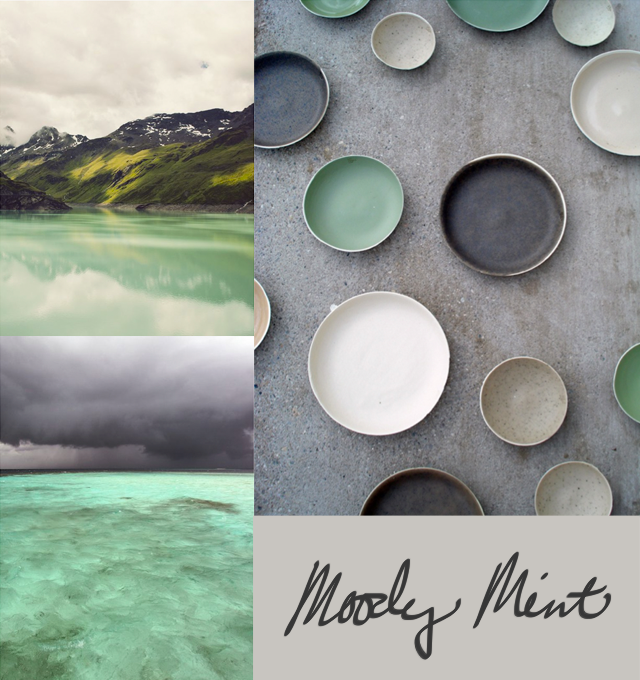 Yesterday was the first rain we've experienced since moving back to LA and I'm sure that the grey morning skies and cool mornings of late have everything to do with my draw to these images.
It was just a light drizzle where we are but when I woke up there were already reports of two car accidents on the freeway that resulted in loss of lives. It's sad and crazy that even the smallest raindrops can throw LA into such havoc. Especially considering the types of torrential downpours we experienced in Malaysia where drivers still do 60+mph with no trouble at all. We're just not used to rain here...be safe out there, kids.
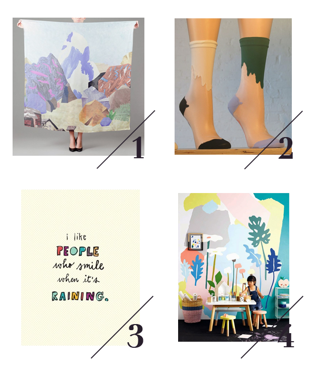
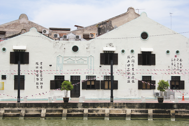
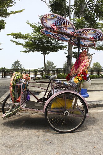
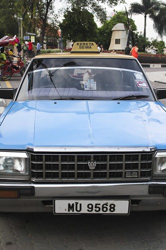
Now, before this post turns darker than the greys above (it is a Friday, after all) let's talk about why it looks different from my usuals. I rarely share things that are not my own photographs or designs but with so much work going on, I felt like mixing things up a bit and playing with a few of my favorite recent Pins. Call it a Friday Freebie if you will ... sometimes you just gotta go with whatever creative itch you've got, big or small.
Go have a great weekend and let yourself do things a little different. It's more fun that way.
melaka
Hello from Rio De Janeiro, Brazil! Can't believe that we're on the other side of the world. It was a twenty four hour trip but all things considered, it's freaking amazing that it's possible.
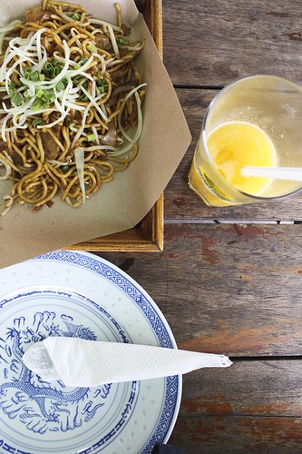
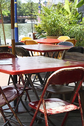
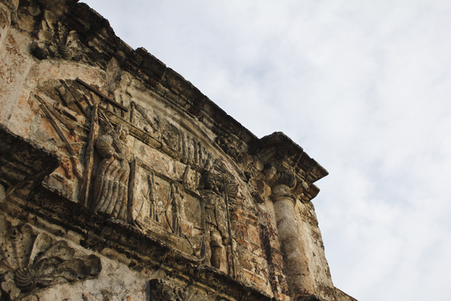
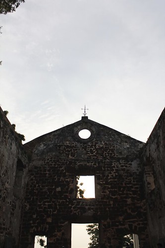
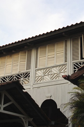
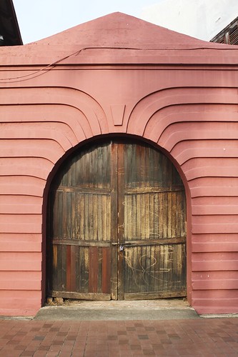
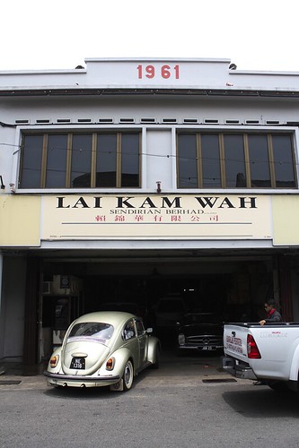
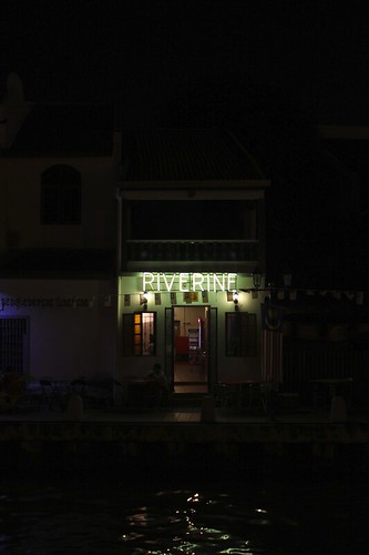
These are some pics from our recent overnight in Melaka, Malaysia, just a two hour drive from KL. Melaka is a World Heritage City so all of the touristy things you'd expect were present: loads of tour groups and buses, souvenir shops, and of course, a Hard Rock Cafe (we skipped the t-shirt).
From a local's standpoint, we've heard that you only really go to Melaka to eat Nyonya food (a mix of Straits Chinese and Chinese/Malay cuisine) but we thought it would be interesting to see what a World Heritage City in Malaysia looked like. The food was as amazing as promised (we went to Riverine, a Nyonya kitchen, twice!) but the architecture was what stood out for me.
In KL there are sadly far too many beautiful old buildings rotting away or being torn down to make room for new luxury malls or condos. The condo we live in is on a street where there used to be traditional homes and I can imagine how gorgeous they must have been based on the last remaining structure on the street. I feel like such an a-hole for lamenting the past while living in modern KL but if I ran the city, I would find a way to do it all better.
In Melaka, the heritage buildings seem to be a priority. Not all of course but a decent amount. It was awesome to see the different influences in design based on the location and date that the structures were built. Being the key port city of the Straits way back when, Melaka has buildings that reflect the Chinese, Dutch, Portuguese, British and of course, Malay aesthetics. I loved the colonial stuff but my favorite was seeing the mid-century modern influences in their Chinatown and government buildings. It made this LA girl very happy.
Now here in Rio, I've already spotted a ton of cool old buildings that I can't wait to check out. I'm not sure I'll take my camera out too much since I'll be exploring solo most of the time but I'll capture and share what I can. Have a great week!
introducing the love malaysia collection
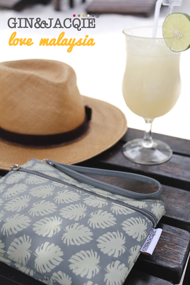
Hi guys, I hope you had a great weekend! Today is Malaysia Day so what better day to share the launch of my collaboration with Kuala Lumpur based bag company Gin & Jacqie: the Love Malaysia Collection! It's been nearly one year in the making and we are SO excited to see it come to life.
I met owner Jacqie soon after moving to KL and we were instant friends. We share a love of travel, design, and entrepreneurship so when she found out about my graphic design and growing love for my new home, she asked if I'd like to create a few prints that represent Malaysia...something that could pique the interest of tourists, expats, and locals alike. I jumped at the opportunity as I've always wanted to do product prints and I loved the idea of playing with images that were recognizable and unique to the country.
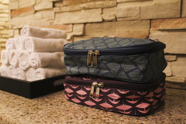
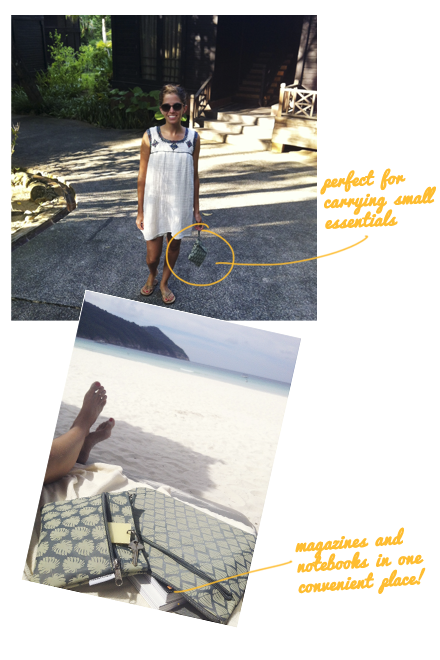
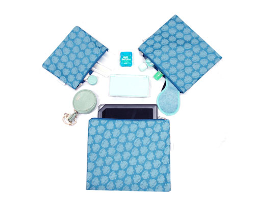
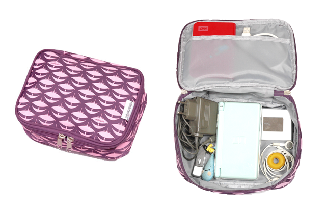
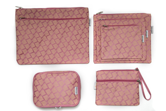
Not only did I get to design the prints but I also got to help design the bags that would be created for the collection! Since Gin & Jacqie is focused on making life a bit easier and more organized while on-the-go, it was easy to decide on the final products. We went with multipurpose pieces like zip pouches that can store anything from makeup to electronic choards, and a handy wrist pouch that can be kept in a larger bag and used separately when you only need to carry a few essentials. As you can see by the photos above, I took a few pieces on a trial run during our holiday last week and they were great! They kept everything tidy and easily accessible at all times...just right for making traveling easier.
Now, about the prints! The prints symbolize three main things that are standouts in Malaysia: food, heritage, and landscape.
For food I designed a pattern of the ubiquitous pyramid-shaped packaging of Nasi Lemak - Malaysia's unofficial national breakfast consisting of coconut rice, dried anchovies, hard boiled egg, rendang or curry chicken or beef, roasted peanuts, and cucumber slices. I'm obsessed with it now and crave it more than I crave tacos (!!! I know). But even better than the taste is the little pyramid shape created when all of the contents are folded into a large banana leaf - a true on-the-go meal!
For heritage I went with the iconic Wau kites. The origin of the name - pronounced 'wow' - is Arabic, the kite tradition is Chinese, and each Malaysian state has their own unique design. It seemed the perfect representation of Malaysia's diverse cultures.
And for landscape I created a tropical leaf pattern that represents the jungle greenery that is everywhere in Malaysia. Even in the city, it's never really a concrete jungle. It's the real deal here and it's awesome.
It's been a great experience to work with the Gin & Jacqie team and I'm beyond thankful for the opportunity to create something that represents a country that I've grown to love so much.
Now it's time to share the goods with you! We're giving away the product of your choice to one lucky Anamu reader. All you have to do is "like" or comment on your favorite product photo in the Love Malaysia Facebook photo album + leave a comment here to let me know that you've done so. We'll pick a name next week, Thursday, and announce the winner on Friday the 27th.
Even if you don't enter to win, I'd love to hear what you think!
mirrors mirrors on the wall
 Every time I leave Malaysia for a while I return with a renewed ambition to see and do everything on our "hit list". It's embarrassing that our list is as long as it is (since we've been here for a year and a half) but the good thing is that with time comes more understanding and appreciation of the things around you.
Friends of ours recently went to the Islamic Arts Museum and highly recommended it for peeks at mosque architecture around the world and of course, artifacts with designs and patterns that are uniquely Islamic. We didn't hesitate in making a date to go the next day.
I was in awe of a miniature model of the national mosque I visited in Abu Dhabi (how do they make it so small?!) and was fixated on a section where the mosaic designs were broken down to basic geometric sketches of shapes from beginning to end. It made me think that had I learned geometry through the art of pattern making I would have enjoyed my math classes much much more!
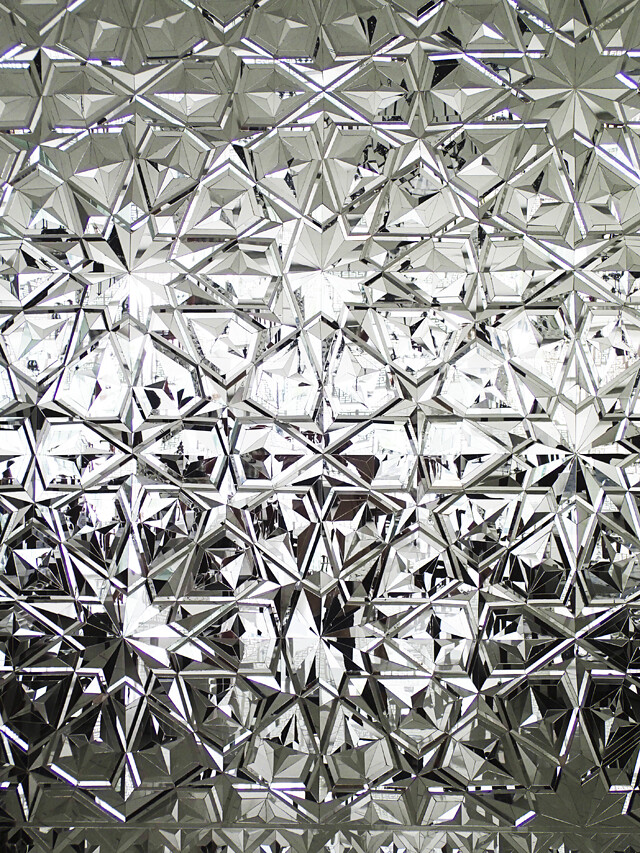
The main stand out for me was this impressive razzle-dazzle wall of mosaic mirrors. Though situated in the restaurant, it's definitely a piece deserving of its own "Modern Islamic Art" section. I don't know if mosaic mirrors are a new thing in Islamic design but it sure feels fresh and I love love love the looks of it for a modern interior. Future home DIY project perhaps?
friday pic & pin
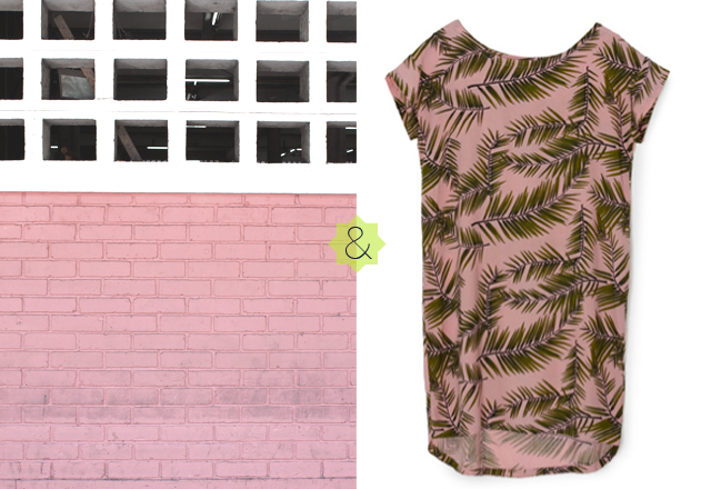 Blogging is strange but wonderful. You put your thoughts, ideas, and creations out into the world without really knowing who might come across them and whether they'll care about them or not. I blog for fun and don't have any big blogger status ambitions but I feel incredibly lucky to have awesome readers who take the time to let me know how much they enjoy sharing in my adventures. I recently received the sweetest email from Emily in response to this post. In it she mentioned that her favorite series was Friday Pic & Pin and I have to admit, it's my favorite too. So, this post is for you Emily. Thank you for inspiring me to keep at my favorite photo-play despite thinking that I could live without it. My Pins and photographs just wanna play together too too much.
And that dress, I wish it were going with me to Vietnam next week; perfect for being on holiday or staying local and feeling like you are.
Have an awesome weekend everyone!
(image left: Brick Wall, Kota Kinabalu by Ana Maria Muñoz, right: Pin viaPlumo)
all framed out
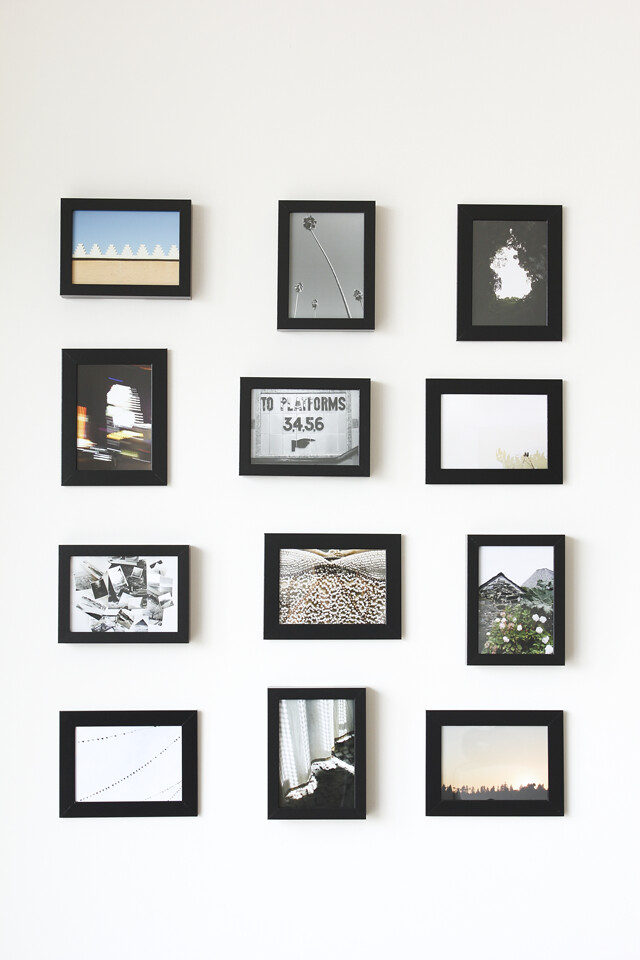
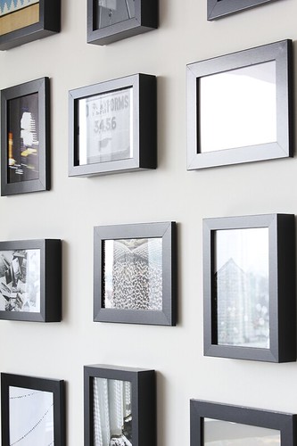
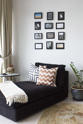
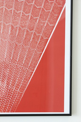
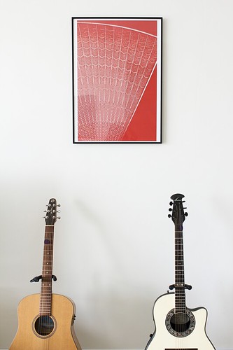
Happy Friday, guys! Wow am I excited for the weekend. Even though I'm planning on getting some work done, I just love the fact that we'll be home. For all of the traveling we do I'm really quite the homebody. That's why I'm so excited to finally have framed all of the photo prints from my shop so we can enjoy them in our living room! I also had a little graphic fun with a photo I took of the Sydney Opera House. Looks kinda like a fan, doesn't it? The color is just the pop that we needed in here.
All perfect timing too since I just received a copy of our home feature in IKEA Malaysia's Live magazine (!!!). We had practically just moved in so it's nice to see what we've done to make it even more homey since then.
Enjoy your weekend!
5x7 frames by IKEA / large frame by Habitat / cushions by {me}longings
tastefully done
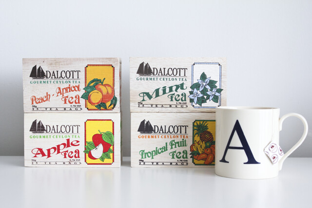
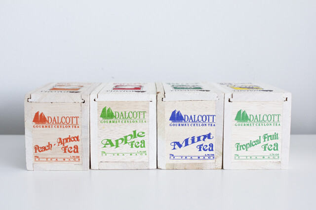
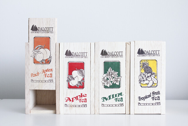
Delicious Sri Lankan tea, crafted re-usable wood boxes, and right-on-point graphics - it's no wonder that I've built up a collection! I was so happy when I discovered them at our favorite grocery store so that I could add a little design-love while making my cuppa. I already can't wait to run out of the Tropical Fruit flavor so that I can buy/try another one.
Do you ever buy food and drink products because of the packaging?
pop displays
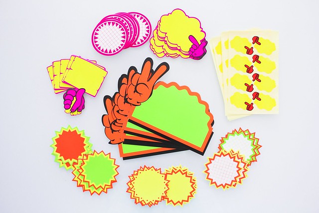 One of the first things I noticed when we moved to Malaysia was the way that some small independent shops display product prices and information. These neon tags are everywhere and they literally make me smile every time I see them. How could they not?! They're bright, playful, and with great geometric shapes and cartoon-ish hands they're hard to miss and not appreciate. When I started seeing packs of them for sale at stationary shops I got really excited because I knew that I had to have them. I have no idea what I'm actually going to do with them but I'm quite happy with the collection that has developed. Do you have any ideas for putting these awesome tags to use, functional or as art?
at last
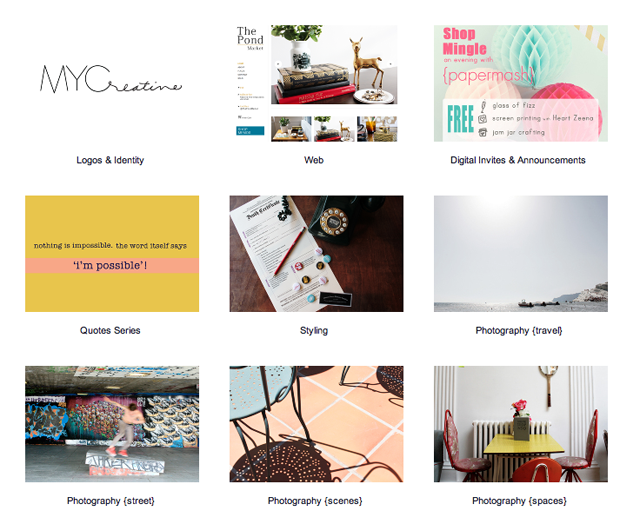 Remember my post about "owning" your title or whatever it is that you do? Well, I finally put together one of the things that makes being a freelance graphic designer and photographer a bit more legit in my book: a portfolio! It was such a satisfying and motivating experience to sort through what I have done and think about the work that I want to continue doing. It still has a lot of room to grow but it's a start. It's my start and I'm excited to share it with you.
Please check it out and do pass it along to any friends, family, and colleagues who might be interested in my work (word-of-mouth <3 is greatly appreciated!). Thank you for being a part of this new creative journey.
friday pic & pin
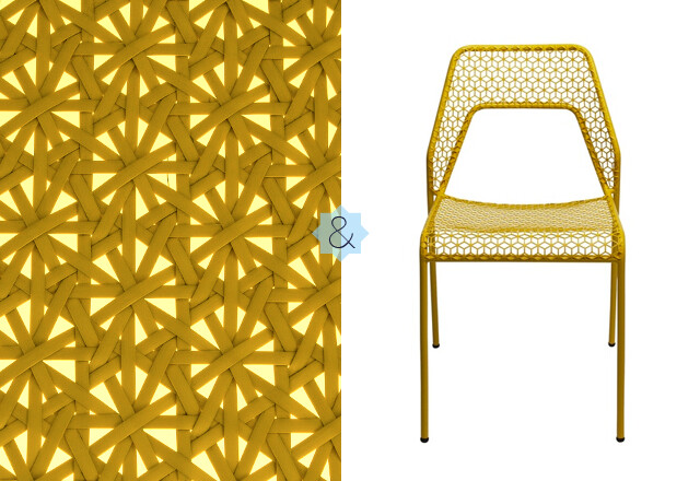 With everyone talking about Fall being just around the corner, I'm psyching myself up for 24/7 summer living. It's a world of difference from last year when I barely saw the sun so this time around I'm definitely thankful to be closer to the equator.
This chair would be my perfect "endless summer" piece; reminiscent of the rattan furniture that Malaysia is known for but totally modern in material and with a retro design twist. I can imagine the shadows it casts while out on a sunny patio or inside a dining room with an overhead lamp. It's rocking my world, it really is.
Hopefully I find more endless summer inspirations while out and about this weekend. Have a good one and stay cool!
This week's three rad links...
• it's a #patternparty and we're all invited via August Empress
• i wanna wear this t-shirt on my wrist, do add recycled gold via EcoSalon
• a girl who knows what she wants and goes for it - let's all make a list via Mrs. Lilien
(image left: mock-rattan in Penang, Malaysia by Ana Maria Muñoz, right: Pin via Blue Dot)
like a pro
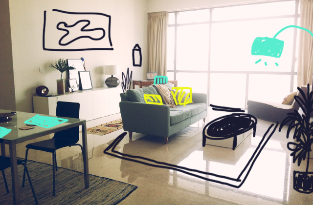 After nearly two months at sea, the three pieces of furniture that we shipped from London have arrived: our duck egg blue sofa, antique wood table, and bed frame + mattress (not pictured). They are home and we are now living more comfortably (yahooo!)
As soon as the movers left we began arranging, and then re-arranging, all of the pieces to see what worked best for our needs. If it weren't for the items that came with the apartment (dining table, chairs, white storage units, TV, table lamp, and lounge chair) then we'd be seriously furniture-poor in this space. And while the provided pieces wouldn't have been our first picks, they're at least simple and modern enough that they blend in nicely with our personal touches.
All that's left to buy are a few furnishings and accessories to make the living room really come together. I've been watching old episodes of the interior design show Candice Tells All on syndication and I love how she goes around with her drawing tablet, whipping up solutions to everyday design problems. Well, I have a drawing tablet, too, so I put that baby to work! We had written a list of what we'd like to buy but drawing everything onto the space was a really fun way to bring it all to life - I highly recommend it!
On our list:
Now, if only Craigslist were popular here. That was the thing to do in LA...buried treasures I'll tell ya...
Either way, I can't wait to start shopping around!
Do you have any methods you use for organizing your home-decor plan of action? Or do you just go for it as you come across pieces?
{happy friday} pic & pin
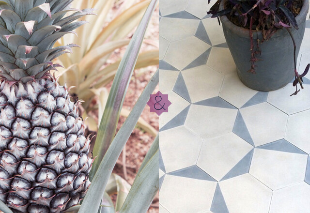 It's the weekend and I'm pretty sure that some fun chores and cleaning are in order. If I had a floor covered with these handmade tiles by Claesson Koivisto Rune for Marrakech Design then I don't think I'd ever mind sweeping up! I got so scroll happy when I first found them several months ago via Remodelista. Well, the design blog has one-upped themselves with a new round up of modern takes on Moroccan tiles - can I have one of each in every room please?!? They are so beautiful. One day, one day...
Have a wonderful weekend!
This week's three rad links...
• Game Boy, floppy disk drive, and AOL login - their sounds + more captured for all eternity in the Museum of Endangered Sounds via Smashing Magazine
• last minute Father's Day DIY gift ideas with an ol' staple: neckties via Ecouterre
• my scandinavian design-loving heart wishes it had an iPad for this new magazine, Trendenser via Poppytalk
(image left: Penang pineapple by Ana Maria Muñoz, right: Pin via Remodelista)
los angeles design, i
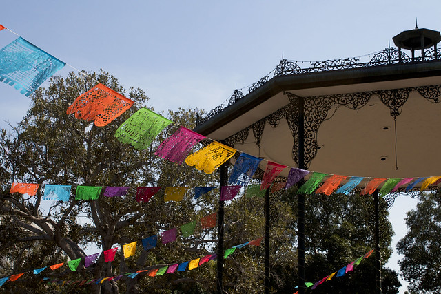
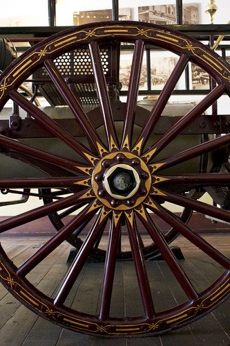
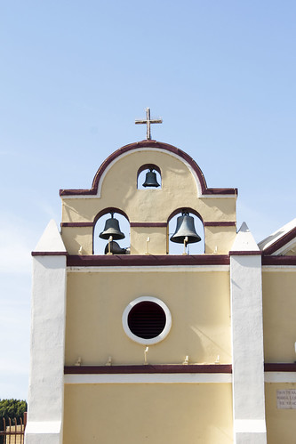
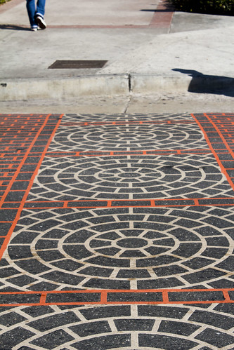
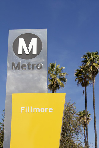
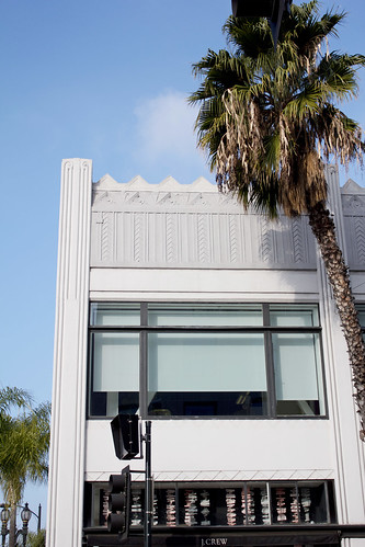
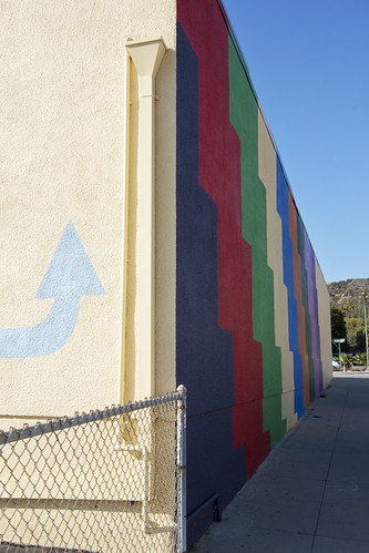
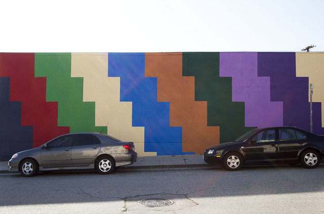

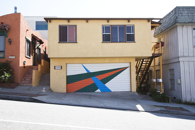
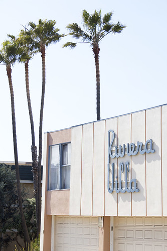
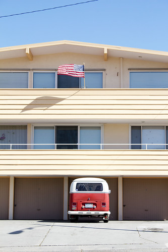
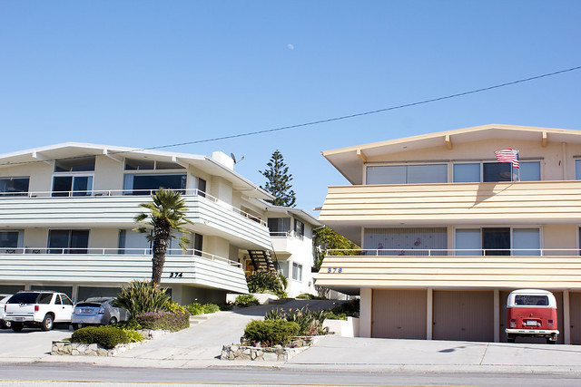
Hola, how was your weekend?
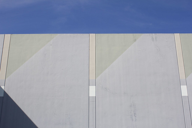
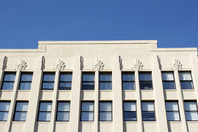
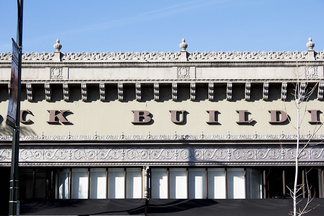
Ours was all about traveling and settling back into our flat; man does it feel good to be home!!! One of the things that I love about London is that the architectural details are so different from everything that I grew up with in LA. When we moved here I became obsessed with noting the tiny details of building facades and period characteristics of the 1600's onwards.
Los Angeles is obviously much newer so going back for a visit after being away for a while proved to be super inspiring. Everything from the Mexican and Spanish Colonial details around El Pueblo/Olvera Street, the Art Deco facades in Old Pasadena, to the simple retro lines of the beach communities ... they all hint to the diversity of design in the City of Angels. I admire and respect the ornate and elaborate styles of traditional European design but when push comes to shove, simplicity and basic geometry always captures my heart. It wasn't until this trip that I realized how much my hometown had influenced my personal design tendencies. I guess sometimes you really don't know what you've got until it's gone...or at least leave it then go back :)
{show & tell} souvenirs from marrakech + giveaway!




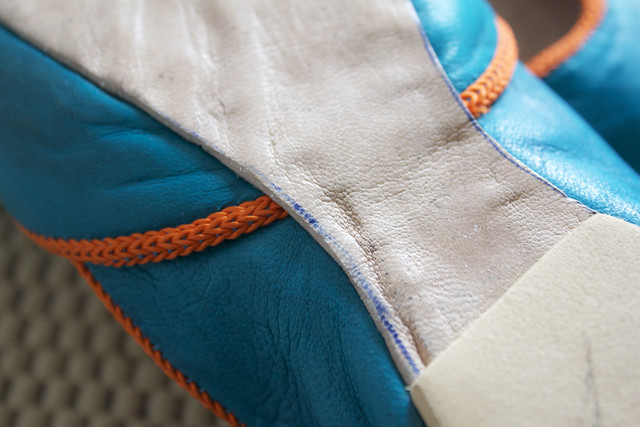
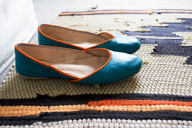
I've been thinking of what to pack for our visit to LA and I'm pretty sure I've forgotten how to dress for 60/70 degree weather - it's going to feel like summertime to me but just how much??? I do know, however, that I'll be taking a few souvenirs from Morocco for family and friends. Weeks after our trip to Marrakech, I still find myself totally inspired by the city's colors, patterns, and textures. Thankfully we brought back a few things to keep the design love going and boy am I enjoying them.
It's hard to pick a favorite but if I base it on what I use the most, the leather slippers are it. After seeing tons of traditional pointy-toe or heel-less styles, these caught my attention with their modern silhouette and ultra bright colors. On closer inspection, you can see the handmade details in the contrast stitching and pen outlines on the sole. It's details like these that reeeaaaaally make my heart sing.
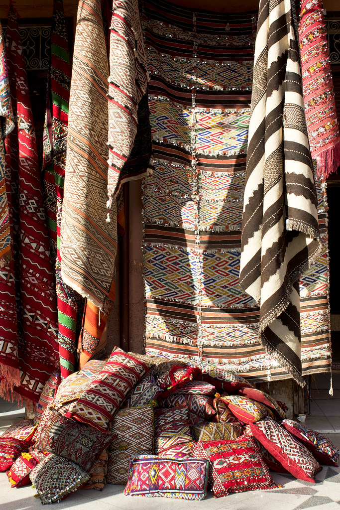
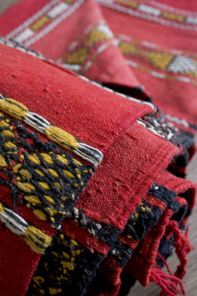
We did find a rug after all and I cannot wait to get it cleaned, roll it out, and enjoy it - such a tease having it just sit there. It's a vintage Berber rug and we spent a good amount of time choosing it while sitting amongst hundreds of colorful woven beauties and drinking sweet mint tea. I totally envision styling it something like this in our future house...it's a lifetime souvenir for sure.
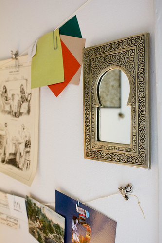
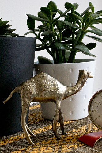
Two other exciting finds were a solid brass antique camel with the coolest designs ever and a hand-carved aluminum mirror that now helps keep the feng shui flowing in my office/guest room/closet. Apparently your back should never face the door but you can correct it with a mirror. I think it's a nice complement to the diy wall display, too.
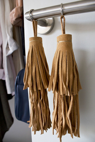
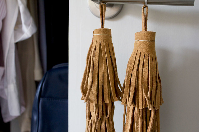
And those rad leather tassels? Those were a gift from the rug merchant and now I will give one of them to you! Put it on your purse, car rearview mirror, door handle, use as a (very large) key chain, or even jazz up a curtain tie with it - there are so many ways you can have fun with it.
If you'd like a shot at winning the tassel simply comment below with your favorite souvenir of all time; truck stop convenience store finds totally count too. I'll pick a winner at random next Thursday and ship it to you asap!
Yay free stuff!
color, patterns, and textures - oh my!
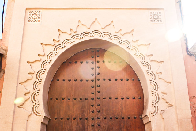
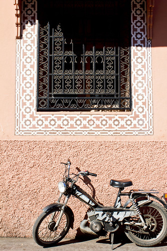
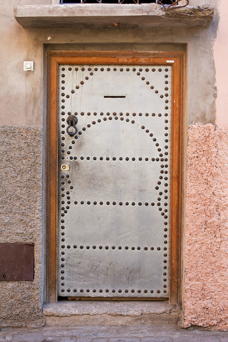
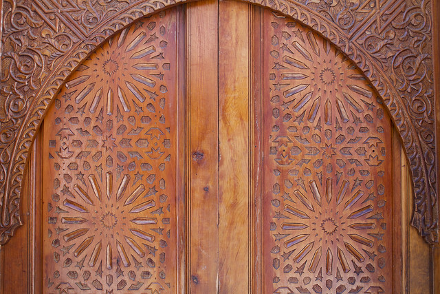
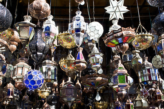
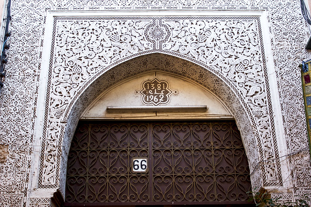
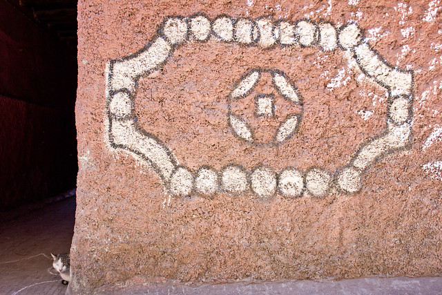
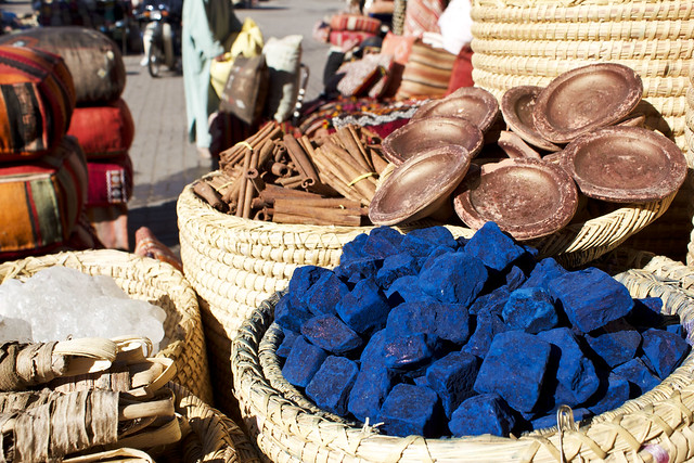
When you're not busy dodging motorcycles and donkeys there are plenty of design details to catch your attention in Marrakech's Medina. I was fascinated by the intricate carvings on both wood and stone, the pretty pastels of the buildings, the bright bold colors in the souks, and the rough and smooth texture pairings on the walls. I peeked into a few craftsman workshops near our riad to see how they use stencils to carve the repeating designs - what a work of art!
Any design details or colors catch your eye?
More Art: off to a resolved year
Okay, so I lied. I do have one resolution: visit more museums and design exhibits. This weekend will kick-off a more artsy and designed infused 2010 with a trip to NYC.
I've got my new boots (Nike Air + Cole Haan = most comfortable shoes ever! Definitely worth the three year search) ...
and am ready for some serious gawking at works by Kandinsky (Guggenheim) and architect Eero Saarinen (Museum of the City of New York).
Must be some kind of crazy to leave 72 degrees in LA for 20 something Manhattan!
::
Ace Hotel: A+ in style all the way
It seems that every time I go somewhere new I end up wanting to live there but this time I really mean it. Spent the weekend at the Ace Hotel in Palm Springs and I fell in love. Dont necessarily need to live in sleepy Palm Springs but definitely want to make a home at the little stylish utopia that is the Ace.
Formerly a run-down Howard Johnson hotel, the Ace exemplifies laid back So Cal with a vintage edge. Every detail in this place is thoughtfully executed with a cool casualness and minimalistic yet functional approach. Nothing feels overdone or under appreciated...every item throughout the hotel gets to shine on its own.
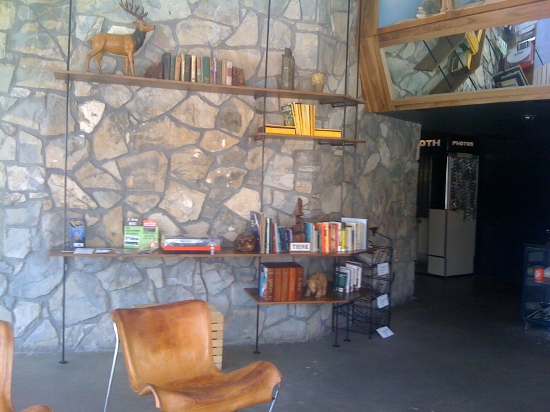
Top top things off, the design and decor not only looks good but it oozes eco-friendliness. The only trace of plastic we saw all weekend was in the cups at pool-side (no glass by the pool rule always wins) and in the spa. Everything else seems to either use wood or natural fibers; signs are hand-painted slabs of wood (hopefully reclaimed) and lawn chairs feature cotton rope suspensions (sounds strange but its super comfy). Even the room key is biodegradable paper!
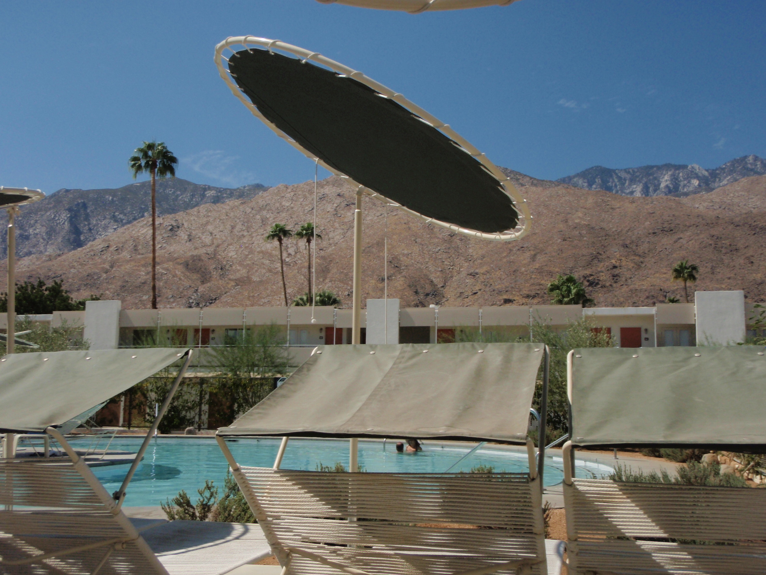
The landscaping is everything you would expect in the desert and hope to see everywhere else too. Native plants, trees, and raked dirt look clean and simple and when facing west, mirror the colors of the rocky mountains in the background.


As for the accommodations: imagine scoring big at the flea market or antique shop and then getting custom carpentry done to compliment the whole look. It was a perfect cross between Americana and mid-century modern, both new and old pieces, that felt like a familiar friend welcoming you home. I would have taken photos while the room was tidy but we were too in awe when we got in (and late for the surprise massage session the boyfriend booked!).
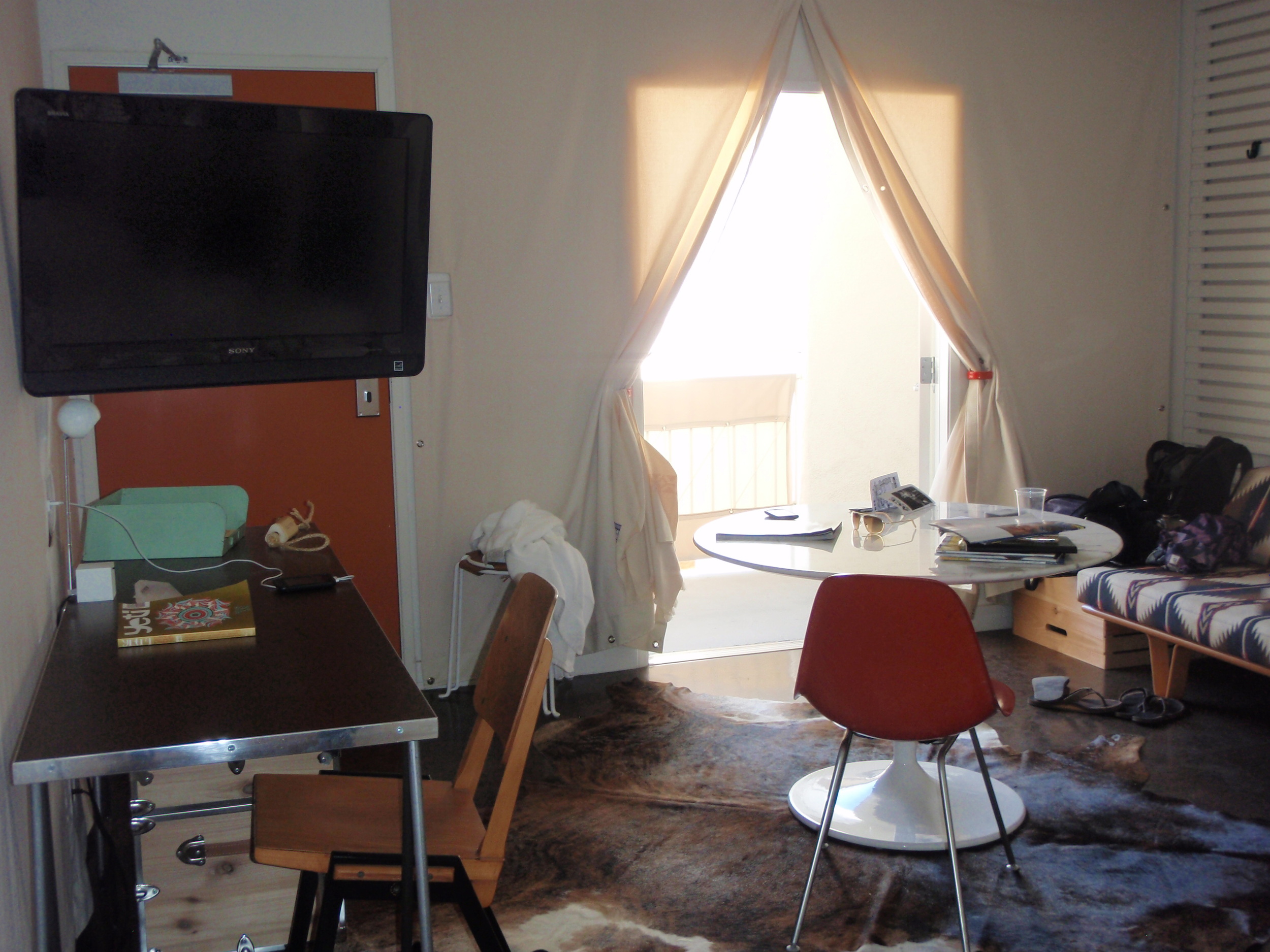
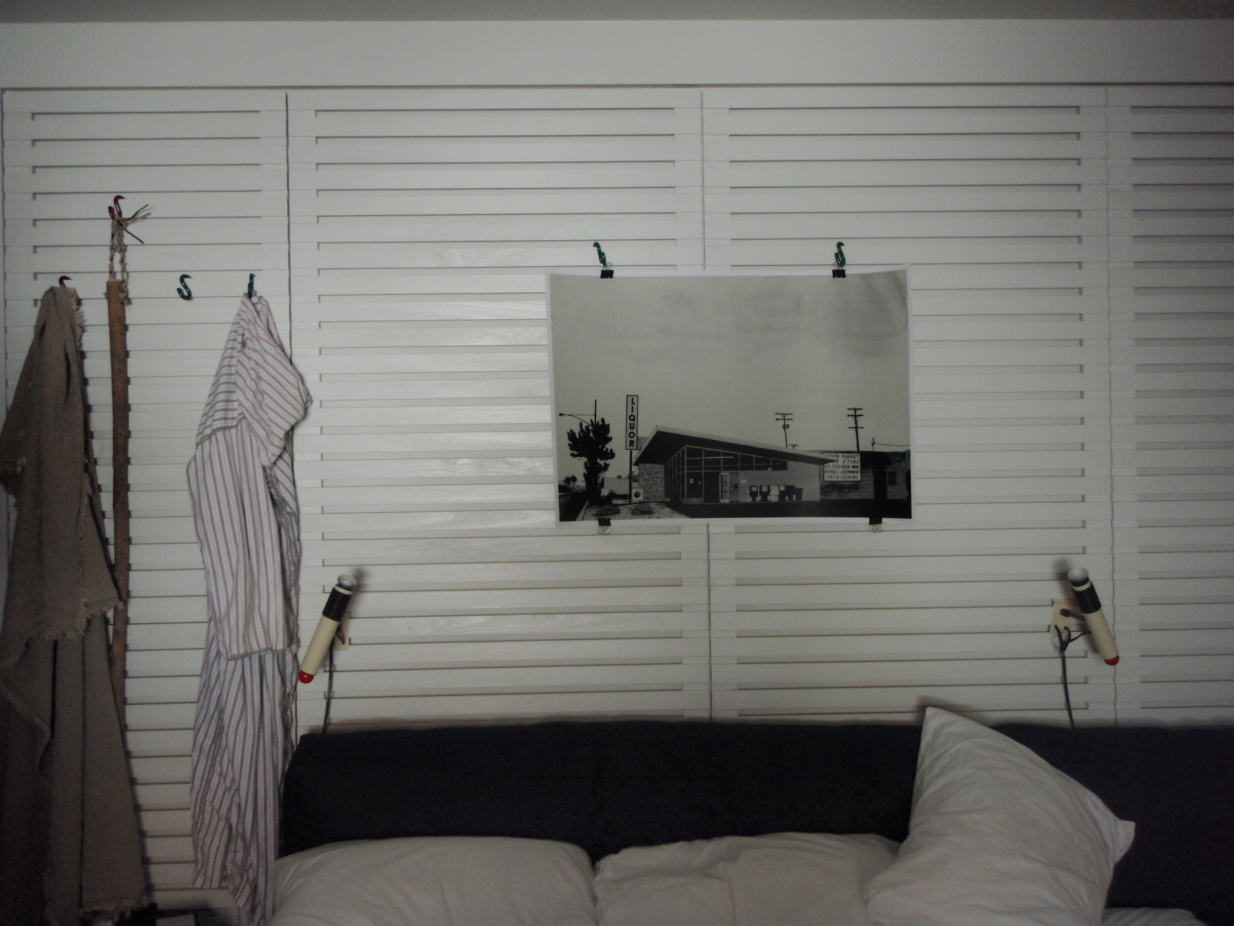
We did more than just drool over the decor and design, too. We drooled over the food... the spa... sweet tunes blasting at the pools...and imagined what it would be like to have a big party there. The entire weekend was exactly what I needed to re-charge before upcoming work travels.
Needless to say we will be going back soon but not soon enough!

